We’ve all been there. We’ve taken time out of a busy day and loaded up a healthcare website to find some crucial bit of information we needed. Something small, something commonplace, something any sane person would put up front and center because, surely, thousands of others have needed this same tiny-but-oh-so-significant tidbit. And yet, thirty minutes, two fits of uncontrollable rage, and one existential crisis later, we’re still wandering through a digital hellscape, our spirit broken, our faith in humanity shattered. Or is that just us?
The point being: ease of use matters. Your healthcare website serves as a crucial touchpoint for patients, potential patients, staff, and jobseekers. Designing such a website demands a user-centric approach to ensure easy navigation, accessibility, and engagement—and prevent mental breakdowns. In this blog, we’ll discuss key strategies for creating a healthcare website that prioritizes the needs of different user groups while maintaining an exceptional user experience (UX).
Healthcare Website Design Needs to Accommodate Existing Patients, Potential Patients, Staff Members, and Career Seekers
Effective website design begins with understanding your target audience. In the healthcare sector, your user groups typically include existing patients, potential patients, staff members, and career seekers. Each group has distinct needs and expectations that should influence your design decisions. This means:
- Each group should have its own distinct page on the website.
- How to navigate to these pages from the landing page should be clear and simple.
- Each distinct page should be designed with the user’s most pressing needs in mind.
Catering to Existing Patients
What does UX design for a specific audience look like? Consider existing patients. What will they need to do on your website most? Manage appointments? Yup. Access medical records? Probably a close second. Receive important updates? Sure. Pathways to these and any other primary user needs should be easy to see and use.
Also important is creating a user-friendly patient portal that allows secure communication with healthcare providers for prescription refills, appointment scheduling, etc. And don’t forget a full-featured mobile experience, as many patients may access the site on their smartphones.
Attracting Potential Patients
For most healthcare websites, potential patients will stand as the primary audience. This means that the landing page should cater primarily to their needs. (But remember, your other audiences should have zero trouble finding their own pages. The importance of this cannot be overstated!)

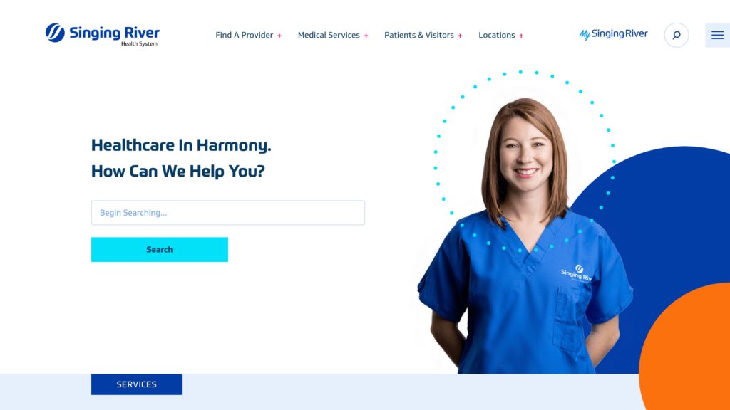
Potential patients are likely to visit your website to gather information about services, physicians, and facilities. Use clear and engaging content to showcase your expertise, patient testimonials, and success stories. Incorporate a user-friendly search function to help users find relevant services quickly.
Factoring in Staff in Your Design
Your website should also serve your staff and potential employees. Create a dedicated section that provides resources for staff members, including policies, training materials, and internal news. For career seekers, an easily accessible and comprehensive job portal can streamline the application process.
An internal portal or intranet enhances communication and collaboration among staff members. Include features such as discussion boards, document sharing, and event calendars. This fosters a sense of community and keeps your staff informed and engaged.
Building a Robust Career Portal for Job Seekers
Jobseekers interested in joining your healthcare institution deserve a seamless experience when browsing job listings, submitting applications, and managing their profiles. Integrate filters to help them narrow down job opportunities and provide clear instructions for the application process.
Prioritizing User-Friendly Navigation and Design
We’ve mentioned ease of use several times in this blog. But what does that look like? Simplicity is key:
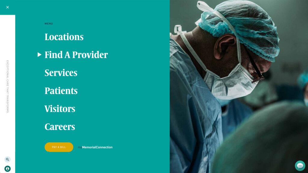
- Start by organizing information in ways that will feel instantly familiar to the user. How? By tapping into their previous website experiences and expectations. Most websites have a navigation bar at or near the top of the page where it can’t be missed. And most websites have links for customer service and jobseekers near the bottom of the landing page. There’s no need to remake the wheel here.
- Beyond logical placement of key features, you want to minimize the number of clicks needed to access critical content. Portals like those for existing patients and staff should feature prominently on the navigation bar and lead to their advertised destinations with one click.
- A combination of a consistent color scheme, typography, icons, and other imagery will make navigation intuitive.
Making Information Accessible for All Users
Web accessibility is crucial in healthcare design to cater to users with disabilities. Ensure compliance with accessibility standards (such as WCAG) to provide an inclusive experience for all users. Incorporate features like alt text for images, keyboard navigation, and proper heading structure.

Designing a healthcare website with a user-centric approach involves understanding and catering to the unique needs of various user groups. By creating tailored experiences for existing patients, potential patients, staff members, and jobseekers, you can enhance engagement, accessibility, and satisfaction across the board. And by sparing them a trip to the center of a digital labyrinth from which they can never escape, you might just keep their fragile faith in humanity intact for one more day.
Questions for our webheads? Schedule a time to chat with one of them using the calendar below.

